

This week has seen a drop-off in new confirmed cases nationwide.
The pattern is shown in the graph above which shows the number of new cases according to the date the test was made. Readers should note that this is different to the statistics usually reported by the BBC, which relate to the date cases were reported, which can be quite different to the date they actually occurred, and invariably shows as a higher figure.
The latest confirmed figures relate to November 8 and show new cases on that date to be down to 12,878. Late reporting may cause an increase in this figure, but any increase is likely to be marginal and will still show a significant fall in numbers.
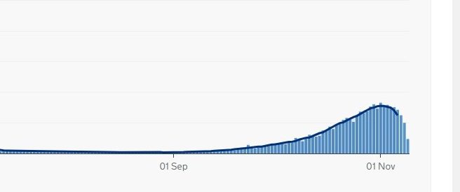
Much the same applies to deaths where Covid-19 is mentioned on the death certificate (but not necessarily where death was caused by Covid-19). Here, the latest date for confirmed figures is November 6 when there were 285 deaths actually recorded for that day. Once more, a significant decrease from the maximum of 331 at the beginning of the month.
For the Rother area, conversely we are seeing an increase in both new cases and deaths.
New cases for the week October 31/November 6 were reported as 61, an increase of 22 over the previous week. This equates to 65 cases per 100,000 of the population. The national average in England is 177.
The national figures are taken from the government website and, as stated above, relate to the precise date a positive test was taken or death occurred. The local figures were supplied to the BBC (and the government) by the NHS and public health authorities and relate to reported cases and deaths. These are therefore less accurate and likely to be slightly overstated.
Image Credits: UK Government .
These figures do not look correct, perhaps Mr Minter could confirm their source.
Looking at the Government data site (https://coronavirus.data.gov.uk/details/cases) the UK figure for cases (by specimen date) on 8 Nov is 19,681, hardly a marginal increase on the 12,878 quoted here. The figure for 9 Nov is currently 27,083 which looks to be the second highest figure yet reported. Single days are clearly not a trend but the numbers are still high. The current BBC headline is that UK daily Covid cases reach a new high of 33,470.
The figure for deaths on the Government site (https://coronavirus.data.gov.uk/details/deaths) for 6 Nov is currently 356, not exactly a significant decrease on 331. Nov 7 shows 327 deaths, Nov 8 341 deaths and Nov 9 is currently 400 deaths.
The figure for deaths (from the BBC) for Rother is 58. Thankfully this seems not to have increased recently.
The reason the numbers you have so diligently found, differ from mine, Jo Buchanan, is that they are updated daily as new information arrives. My figures were taken from reports current at the time I wrote the article – two days prior to your comment. You will almost certainly find that they will have changed again later today. However that should not obscure the fact that the curve of deaths is significantly flatter than it was in the spring and has peaked to date at only just over one third of the spring peak. It is not possible to compare the numbers of cases of infections with those earlier in the year as very little testing was being done at that point.
However, this does not disguise the fact that, despite yesterday’s reported spike in infections, the moving average still shows a leveling off of both infections and deaths, and just the beginnings of a downturn. If this continues, we should indeed be grateful, for this is the time of the year when respiratory infections of all kinds are usually on the increase.
It will also, I hope, mean that the government, influenced as it is by its doom and gloom scientific advisers, whose forecasts have been so wildly inaccurate throughout the pandemic, will have no excuse to extend the current lockdown beyond December 2.
Finally, in answer to your very first question, the figures are the official government ones confirmed by the independent ONS.
The number of deaths at any one time reflects the number of cases somewhere between two and three weeks before. So if cases are falling now, deaths will drop off by the end of the month.
Reported “cases” are positive tests in people who may not have symptoms. I have been calculating the percentage of tests that are positive and it hasn’t changed a great deal over the last six weeks, hovering around the 7% level. So more “cases” mirrors more tests and does not necessarily mean a rising incidence. What is confusing though is not only that there are two ways of reporting – by date reported or by date test was done – but the numbers get altered as time passes, because delays in processing lead to additional numbers being added as these come in.
Overall it appears that the excess death rate (the rate compared to that expected normally) is not very great and also not increasing greatly. Encouraging, but not a reason to relax preventive measures yet. Likewise, while hospitals may be under strain, not helped by staff having to isolate, it always gets bad at this time of year because there’s no slack in the system.
More updates on my blog at https://bamjiinrye.wordpress.com.
Sad to say there is a covid 19 case emerging from Rye primary school today, and some of the youngest have been sent home until the 23rd November.
EDITOR’S NOTE: “Parents at Rye Primary School have had an email today (Friday 13th) saying that two children who had not been demonstrating symptoms have been tested for covid and are isolating. Children in the same “bubble” in the school will have to stay at home for two weeks, but the other “bubbles” will not be affected”
A very interesting article and discussion. Thank you.
They highlight the need for standardised reliable statistics not just for domestic use, but international comparisons too. For example, the banner headline that we have the highest death toll in Europe is not true on the deaths per 100,000 measure, Additionally, the different ways of counting (France apparently ignores home deaths). The confusion maybe grist for tabloid headlines, but are not actually helpful.
Lastly, I don’t know if it is still the case, but certainly at the start, Germany only recorded a death as being Covid if confirmed by an autopsy. I wonder what the world’s figure (to say nothing of our own) would look like if that were the criteria?
In the UK pathologists were specifically directed not to do post mortems, but there are anyway not enough to have managed. The policy severely inhibited the ability to analyse the exact pathology in lungs and elsewhere. It also underlines the fact that some people die with Covid rather than from Covid.
That apart, Michael is right to point out that the crude figures are very misleading. Deaths per 100,000 id a much better comparator, but even then newspapers like The Times distort perception by showing only countries with a population greater than 50 million, thus excluding European nations such as Belgium which have a higher rate than the UK. Lastly if you look at excess deaths (above the average for the time of year, averaged over the last three or five) it’s not bad at all currently.
How the figures are displayed seems to depend to some extent on the message you wish to convey.
I am interested by your correspondent’s claims that the government’s scientific advisers have been ‘so wildly inaccurate’ in their forecasts. This is in itself is demonstrably a wildly inaccurate appraisal of what has been said and forecast.
Some of us will always remember the foolishly unscientific and wildly inaccurate forecast by Michael Fish the night before the hurricane. He sent us to our beds saying no such thing was going to happen.
I like my scientific advisers to ALWAYS give the worst case downside as a POTENTIAL outcome and to always err on the side of caution.
But of course caution, sensible evaluation and warnings have taken a back seat in so many people’s minds since Gove, Cummings, Johnson and their team cooked up the Project Fear pejorative as a cheap sell slogan for their particular and peculiar vision by attacking anyone who didnt agree with their fanciful notions, and amplified this with the former education and justice secretary denigrating and then attempting outrageously to silence all experts!
It is not that long ago that South Africa’s devastating HIV Aids epidemic was amplified and hundreds of thousands of people died needlessly because a deeply foolish President Mbeki refused to accept medical evidence, and banned highly effective antiretroviral drugs being used, despite being given free, as he believed there was no virus!
Give me scientific forecasts and sensible advice and politicians who listen and act on them any and every day.
Hmmm…interesting, Andy. So you feel that a forecast at the beginning of all this, of 500,000 deaths, when in fact there have been just one tenth of that figure, is not wildly in accurate? There have been other exaggerated forecasts since (although admittedly not quite so wild as the first) culminating in the recent suggestion that deaths would rise to 4,000 a day, when so far they are again just one tenth of that. In fact Messrs. Witty and Vallance recently had to apologise to a Commons committee for using that figure, which they did at least have the grace to admit was unnecessarily frightening. The ONS, incidentally, said last week that average infections had stabilised two weeks before lockdown started, which made the 4,000 deaths figure even more absurd. I stand absolutely by my description of ‘wildly inaccurate’.
You ask for scientific forecasts and sensible advice. I think we would all like that, we have just not been getting it.
As for your comparison with Mbeki and Aids, while I might agree with your description of the man, no one is denying Covid19. There is no comparison between the two events.
They did not forecast these figures. They gave a range and, quite rightly, a worst-case scenario, depending on outcomes and trends.
I have a friend in a coma in Brighton with Covid-19 who has just had a tracheotomy. For him and his family, attacking scientists for doing their jobs is not helpful.
I am sure when one of the earliest victims of Spanish flu died in New York in May 1918 there were scientists who were predicting scary outcomes and other amateurs saying ‘gotcha’ when the numbers didn’t materialise immediately.
One hundred years later, that man’s dreary grandson has lead a global campaign in attacking scientists and their predictions, calling into question the severity of the disease in terms of numbers and outcomes and falsely predicting its immediate disappearance.
The first man? The one-time brothel owner Freidrich Trump.
The grandson? The most dangerous man on the planet.
Even the range was inaccurate. It’s instructive to compare the projections made by the government (Public Health England) and other centres – my blog has a nice graph – to see not just big differences but one remarkably accurate prophesy from Warwick. It goes to show that science is inexact. But also if you are going to give a worst case scenario you should ensure this is based on the correct data, and PHE’s was not, as was later admitted.
As far as severe Covid goes I wish Andy Stuart’s friend well. However… I submitted a treatment plan to PHE in April. The rationale was sound and several of my elements are now in use, six months late, but it is still the case that there are no national guidelines for diagnosis of developing severe Covid nor its management. The wrong people have been overseeing this and i believe there has been much unnecessary suffering as a result.